How to build a professional dashboard UI
Density, hierarchy, tables and empty states — what separates a dashboard people work in from one they screenshot.
UT Studio8 min read
Dashboards are designed for a screenshot and used for eight hours. Almost every difference between the two comes down to density, and to what happens when there is no data.
Density is a feature
Marketing pages breathe. Dashboards should not. Someone scanning a hundred rows for the one that is wrong is served by tight line height, compact rows and small type — the opposite of every instinct trained on landing pages.
| Property | Marketing | Dashboard |
|---|---|---|
| Base font size | 16–18px | 13–14px |
| Row height | — | 32–40px |
| Section spacing | 96px | 24–32px |
| Content width | 65–75ch | Full width |
One primary action per screen
A toolbar with nine equally weighted buttons has no primary action. Pick the one thing this screen exists to do, make it the only filled button, and demote the rest.
Tables are the product
Most dashboards are a table with decoration. Get the table right and the rest follows.
- Right-align numbers and use tabular figures, so columns of digits line up and a wrong order of magnitude is visible.
- Freeze the header on scroll. Reading row 200 while guessing at column names is a real cost.
- Put the row action at the end of the row, not behind a hover-only menu — hover-only controls do not exist on touch.
- Make sort and filter state visible in the URL. "Send me what you are looking at" should be a copy and paste.
- Paginate on the server past a few hundred rows. Client-side filtering of 50,000 rows means shipping 50,000 rows.
Design the empty state first
Every list is empty on day one, and the empty state is the first thing a new customer sees. It should say what the thing is, why there is nothing, and offer the one action that changes that.
There are four empty states, not one
Nothing yet; nothing matches your filter; nothing you have permission to see; something failed. They need different words, and shipping one message for all four is why users think the product is broken when they have simply over-filtered.
Loading without layout shift
Skeletons that match the shape of the content they replace. A spinner in the middle of a page tells the user nothing about what is coming and guarantees a jump when it arrives.
Keyboard and focus
People who use a dashboard daily stop using the mouse. Reachability in a sensible order, a visible focus ring, Escape closing the top-most layer, and focus returning to the control that opened a dialog.
Hover-only interfaces exclude touch and keyboard entirely
If an action is only reachable by hovering a row, it does not exist on a tablet and it does not exist for a keyboard user. Make it visible, or reachable on focus.
Templates with real operational surfaces
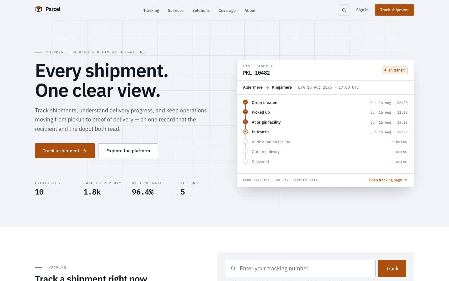
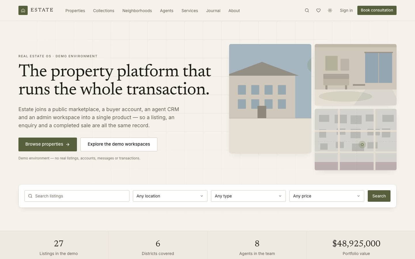
Templates mentioned here
Everything above is written against real products. These are the ones this page draws on.