What should a modern admin dashboard include?
The screens an internal tool actually needs, and the ones that get built because they demo well.
UT Studio7 min read
Admin dashboards get built in the wrong order. The chart-covered overview arrives first because it demos well; the search that staff use forty times a day arrives in month four.
What staff actually do
Watch someone use an internal tool and the pattern is nearly always the same: find one record, look at it, change something, move on. Everything else is decoration on top of that loop.
- Find a specific record — by name, email, order number, whatever they have.
- Read its current state, including its history.
- Change one field, or perform one action.
- Confirm it worked.
Build that loop first, and build it well.
The screens worth having
| Screen | Priority | Why |
|---|---|---|
| Search across entities | First | The entry point to everything |
| Entity list with filters | First | Where staff live |
| Entity detail with history | First | "What happened to this?" is the most asked question |
| Audit log | Early | Answers "who changed this" without a database query |
| Bulk actions | When the list gets long | One at a time stops scaling |
| Overview with charts | Late | Pleasant; rarely load-bearing |
Search is the product
If staff cannot find a record in one search box, everything else is slower. It should accept whatever the customer just read out — an email, an order reference, a partial name — and it should be one field, not a form.
History beats a current-state view
Most support questions are about the past. A detail page that shows only the present forces staff into the database, which is slow, risky and untracked. An event timeline on the record answers most tickets without escalation.
Permissions that are visible
Two rules that prevent most permission bugs and most support confusion:
- Do not render controls the viewer cannot use. A disabled button with no explanation is a support ticket.
- Check on the server anyway, per page and per action. Hiding a control is presentation, not authorisation.
A hidden control is not an access control
If the only thing stopping an action is that the button is not rendered, the action is available to anyone who can send a request. The check belongs on the server, every time.
What to leave out
- A dashboard of metrics nobody has asked for. Charts age badly and are rarely the reason anyone opens the tool.
- Real-time updates on lists people read rather than watch.
- Configurable layouts. The configuration screen costs more than the flexibility returns.
- A theme switcher, unless staff use it at night. This is genuinely nice and genuinely not first.
Templates with real internal surfaces
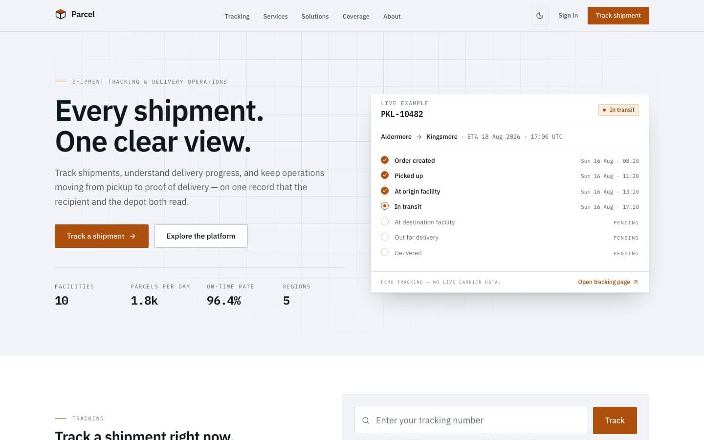
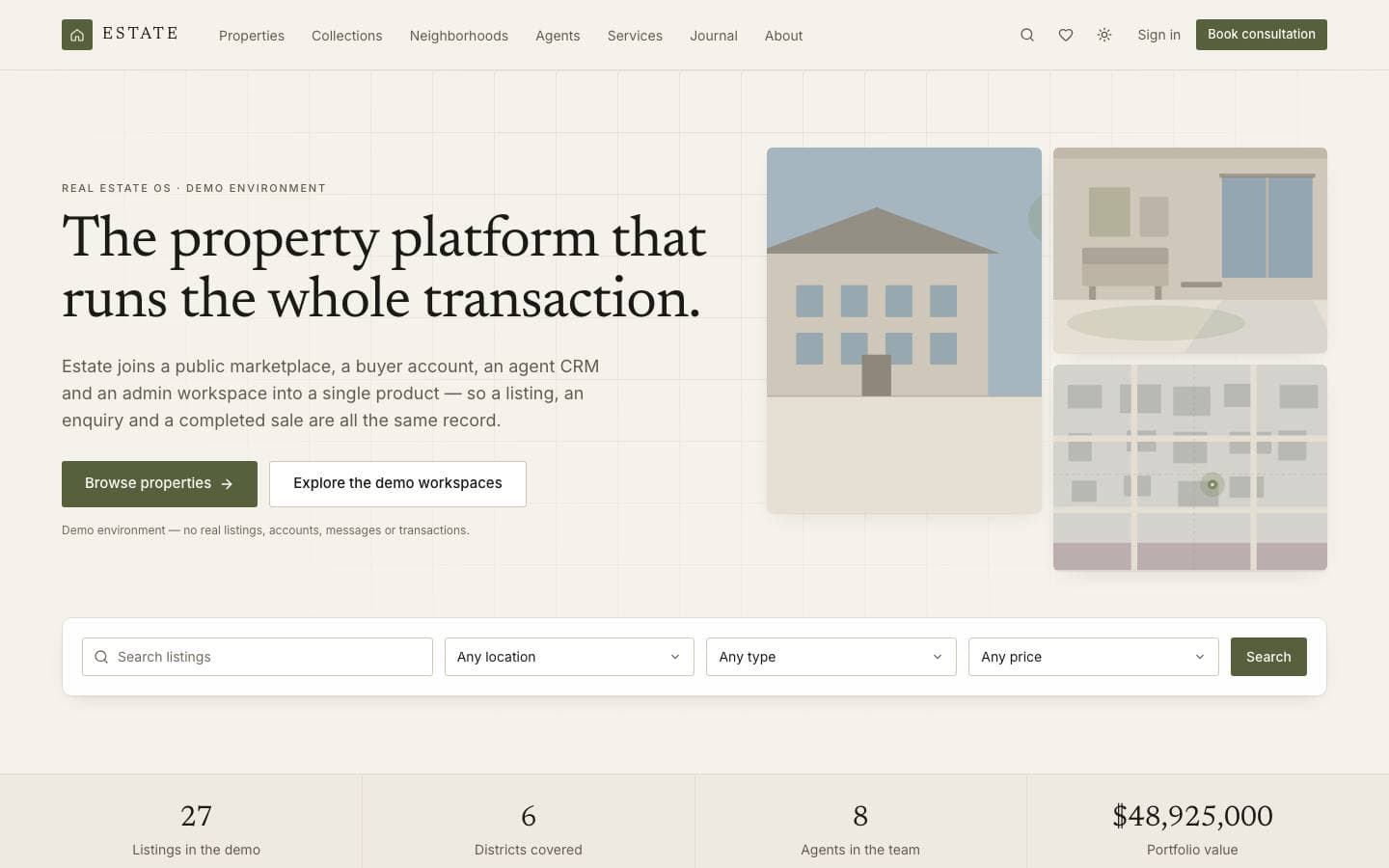
Templates mentioned here
Everything above is written against real products. These are the ones this page draws on.