1.0.0
Initial commercial release
- addedInitial commercial release
Frontend building-block library: primitives, patterns and complete starter products
Preview only — not yet on sale.
Pro licence · what that covers
What this template is for. Each one is a filter in the catalogue, so the products beside it solve the same problem.
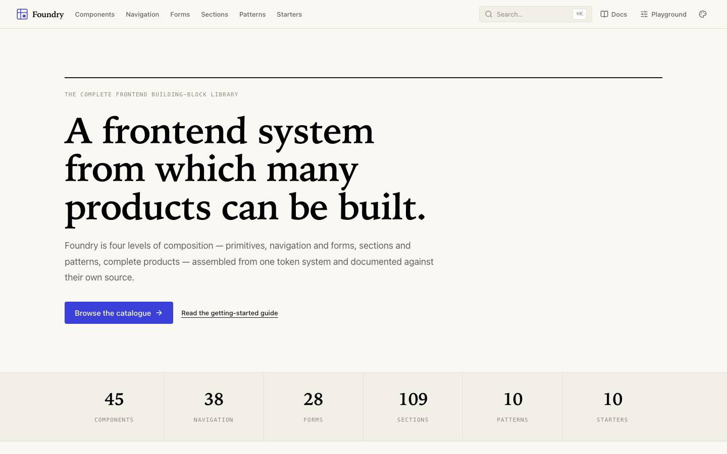
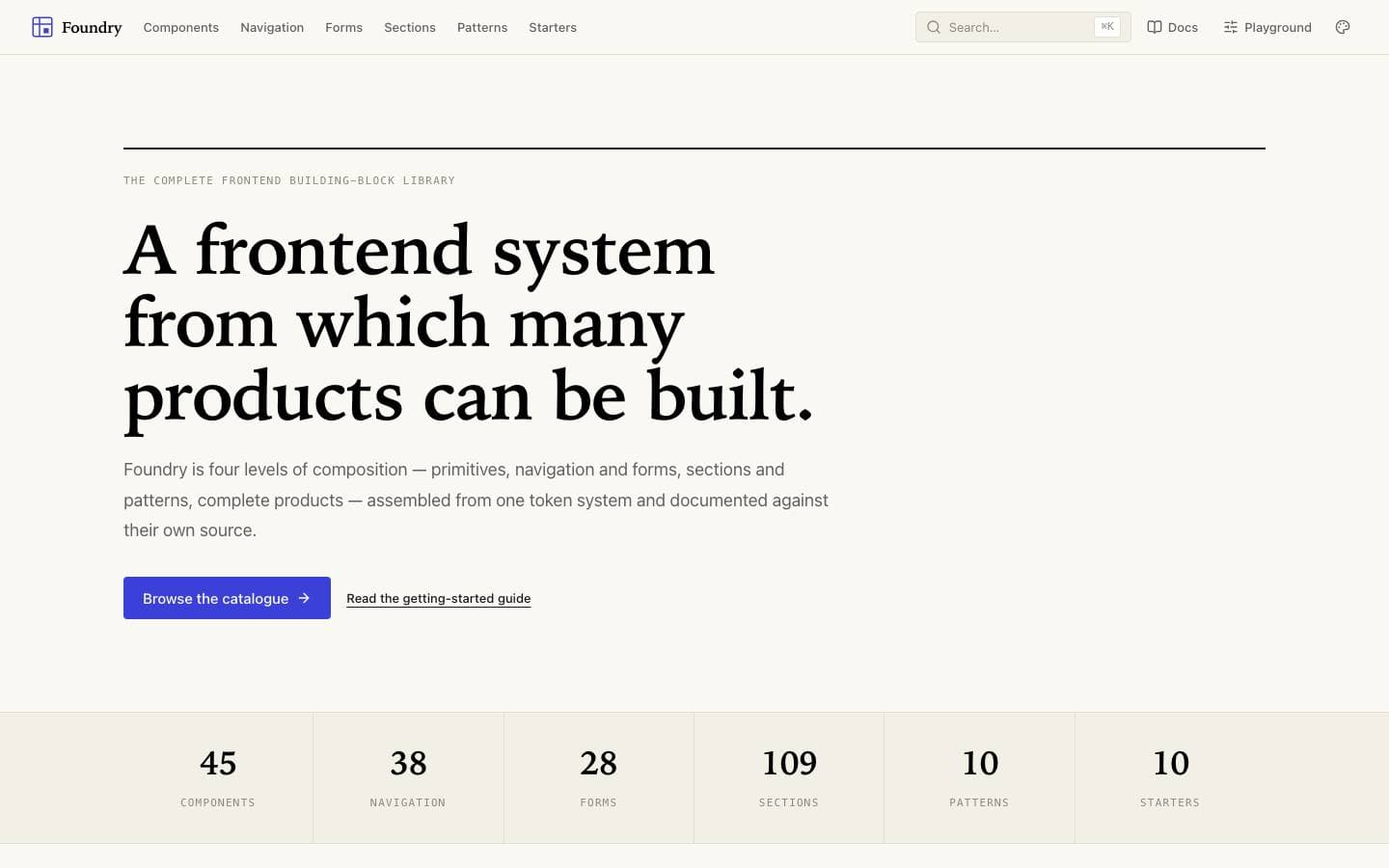
Foundry is the layer beneath the other templates: a frontend system from which many products can be built. Four levels — primitives, navigation and forms, sections and patterns, then ten complete starter products — every one of them composed from the same token set. The point is not the component count; it is that level four is demonstrably assembled from level one, so nothing in the catalogue is a one-off.
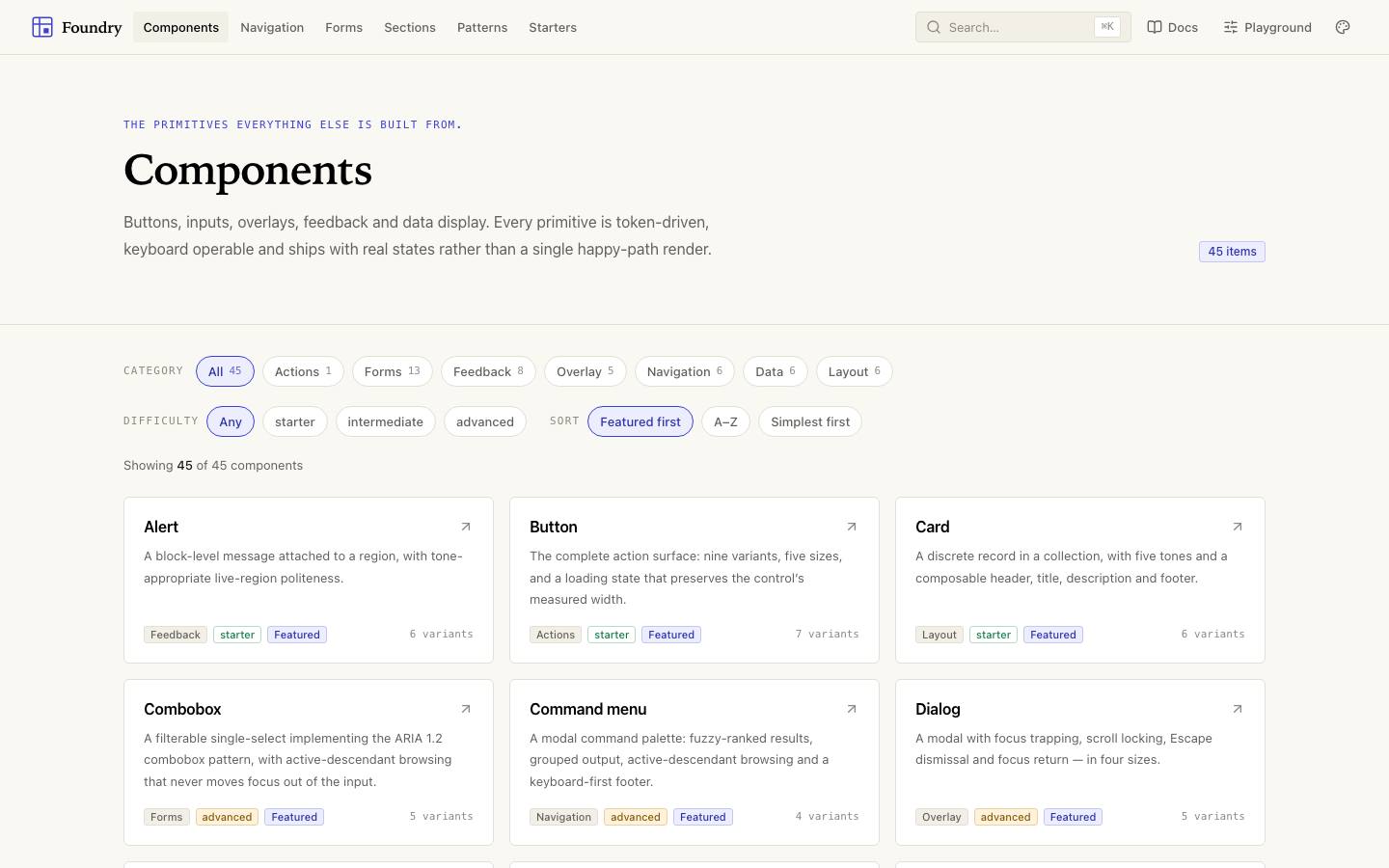
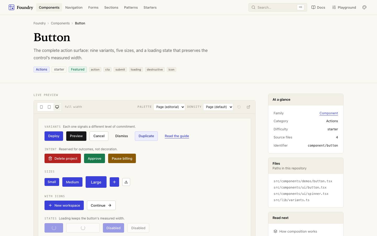
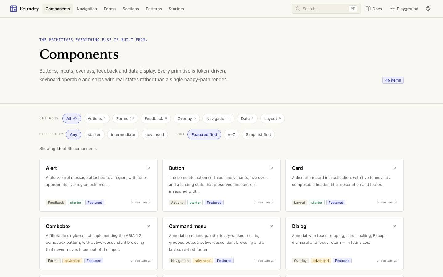
Button, Field, Combobox, Alert, Toast and Card, every one built on the same token set.
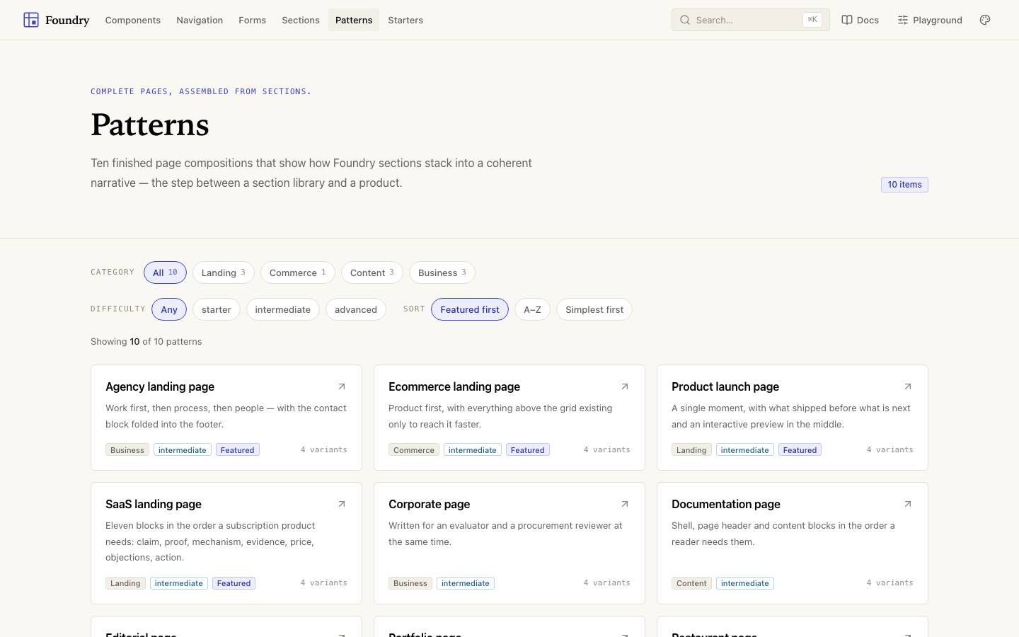
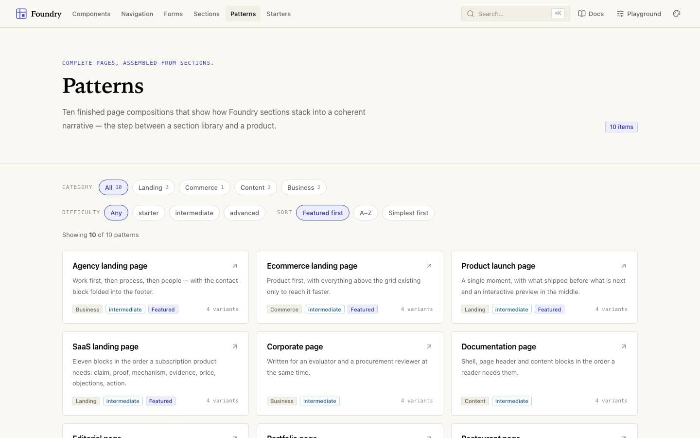
Composed page-level patterns showing how the primitives are meant to be used together.
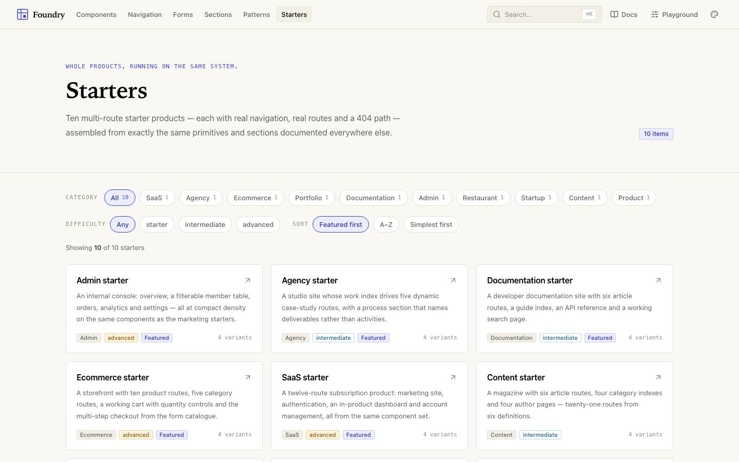
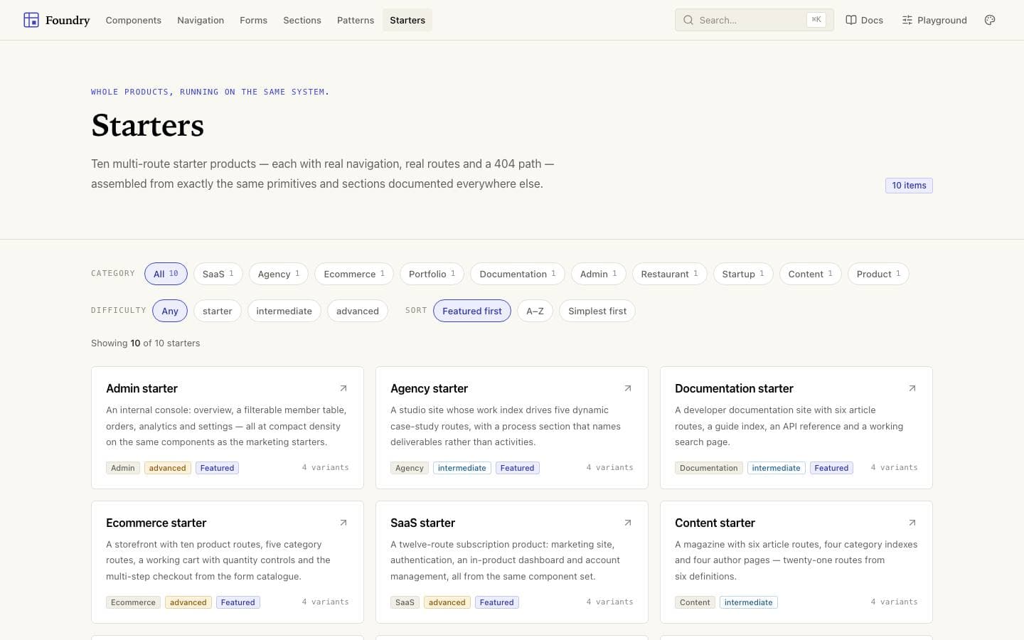
Ten complete products assembled from the catalogue — the only honest proof a system composes.
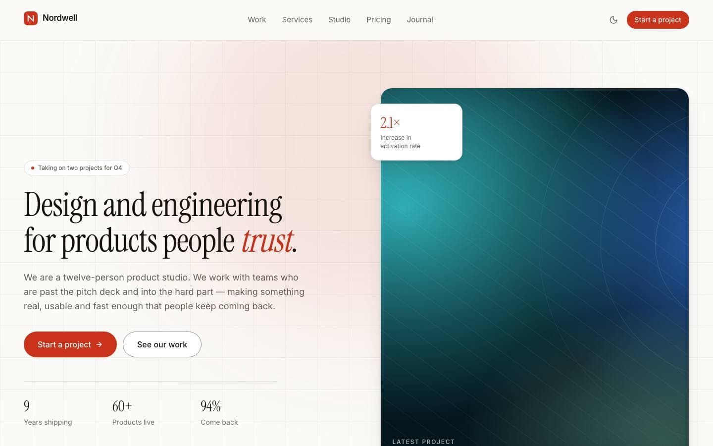
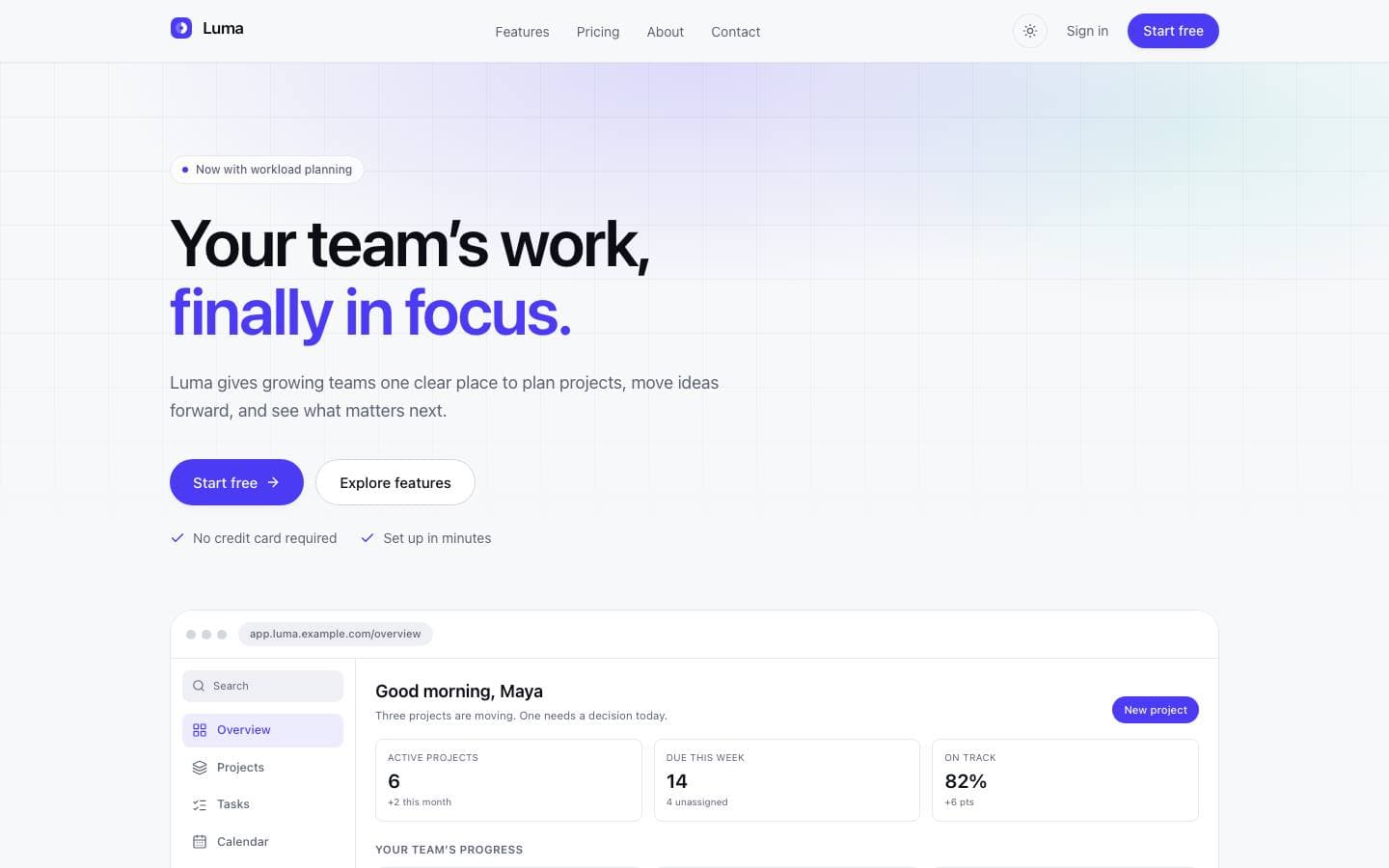
Every screen below is the deployed template, captured from its own live preview.
01
Button, Field, Combobox, Alert, Toast and Card, every one built on the same token set.
02
Composed page-level patterns showing how the primitives are meant to be used together.
03
Ten complete products assembled from the catalogue — the only honest proof a system composes.
Every line above is read from this product’s own licence and release record rather than written beside it, so it cannot promise something the release does not contain.
Each level is assembled from the one below it, and none of them reaches past its neighbour. A starter product is sections; a section is navigation, forms and primitives; a primitive is tokens. That constraint is what makes a theme change propagate correctly instead of leaving a stranded colour in a footer nobody looks at.
Tokens
  └─▶ Primitives (Button, Field, Card, Alert, Toast)
        └─▶ Navigation and forms (Combobox, menus, validation)
              └─▶ Sections and page patterns
└─▶ Starter productsfoundry/
├── app/
│ ├── components/[slug]/page.tsx
│ ├── navigation/page.tsx
│ ├── forms/page.tsx
│ ├── sections/page.tsx
│ ├── patterns/page.tsx
│ ├── starters/page.tsx
│ └── playground/page.tsx
├── packages/
│ └── tokens/
└── components/The archive contains the full source. There is no installer and no post-install script.
unzip foundry.zip
cd foundrypnpm installCopy the example file and fill in the variables listed under Environment variables.
cp .env.example .envpnpm devRuns formatting, lint, type-check, tests and a production build.
pnpm check| Variable | Required | Description |
|---|---|---|
DATABASE_URL | Required | PostgreSQL connection string. Use a pooled endpoint in serverless environments.postgresql://user:pass@localhost:5432/app |
NEXT_PUBLIC_APP_URL | Required | Absolute origin of the deployment. Used for canonical URLs and metadata.https://app.example.com |
LOG_LEVEL | Optional | debug | info | warn | error. Defaults to info in production. |
Zero-config. Set the environment variables listed above and connect the repository.
A multi-stage Dockerfile is included, producing a standalone image with no build toolchain.
Builds to a standard Node server. Nothing depends on a platform-specific runtime.
| Technology | Versions | Status |
|---|---|---|
| Next.js | ≥ 15 | Supported |
Initial commercial release
Initial commercial release
Documentation ships with the first release.
No. It ships as source you own and edit, which is the point — a design system you cannot change is somebody else’s design system. Publishing it privately for your own team is a supported use of the licence.
Curated by us, not inferred — these are the ones that genuinely pair with it.
Other products solving a similar problem.
Products that share a framework with this one.
Documentation and guides that use this template as their example.