How to customise a Next.js template without fighting it
A layered approach to changing a template — content, then tokens, then components — that keeps upgrades cheap.
UT Studio8 min read
The difference between a template that adapts and one you end up fighting is rarely the template. It is usually the order the changes were made in.
Work outside-in: content first, then tokens, then composition, and only then components. Each layer is cheaper to change than the one after it, and each one you resolve at the right level is a merge conflict you never see at upgrade time.
Layer 1 — content
Change every word you can before you touch anything visual. It sounds backwards, and it is the fastest way to find out whether the template actually fits: a section whose copy you cannot write is a section you do not need.
export const FEATURES = {
  heading: 'Everything the operations team asked for',
  items: [
    { id: 'audit', title: 'Full audit trail', body: 'Every change, attributed.' },
  ],
} as const;
Delete sections at this layer
If you cannot write honest copy for a section, remove the section. Filling it with placeholder text defers the decision to launch day, which is the worst possible time to make it.
Layer 2 — tokens
Brand next. One file, a handful of values, and the whole template moves — including the dark theme, which is the part that silently breaks when people skip this layer and edit components instead.
@theme {
  --color-primary: oklch(0.55 0.19 258);
  --font-sans: "Inter Variable", system-ui, sans-serif;
  --radius-panel: 0.5rem;
}
Check contrast after the brand change
Tokens apply your colour faithfully everywhere, including where it now fails against a light surface. This is the one step where a brand change can produce an accessibility regression.
Layer 3 — composition
Now reorder. A page is a list of sections; most "we need a different layout" requests are answered by moving three elements and deleting a fourth.
export default function HomePage() {
  return (
    <>
      <Hero content={HOME_HERO} />
      <Section id="proof"><Logos items={LOGOS} /></Section>
      <Section id="features"><FeatureGrid content={FEATURES} /></Section>
      <Section id="cta"><CallToAction content={HOME_CTA} /></Section>
    </>
  );
}
Layer 4 — components
Only now, and only for what the first three layers could not express. When you do reach this layer, prefer adding a component beside the existing one rather than rewriting it in place: the original keeps receiving upstream fixes, and your version is obviously yours.
Adding a route
- Create the folder and `page.tsx` under `app/`.
- Export metadata built from the same helper the other routes use, so the canonical is right without thinking about it.
- Put its copy in a content module.
- Add it to the route manifest so the sitemap includes it.
Keeping the upgrade path open
| Change | Where it belongs | Upgrade cost |
|---|---|---|
| Wording | content/ | None |
| Brand colour, type, radius | Token layer | None |
| Section order | Page composition | Low |
| New section type | New component | Low |
| Editing a shipped component | In place | Every future release |
Templates that show the layering clearly
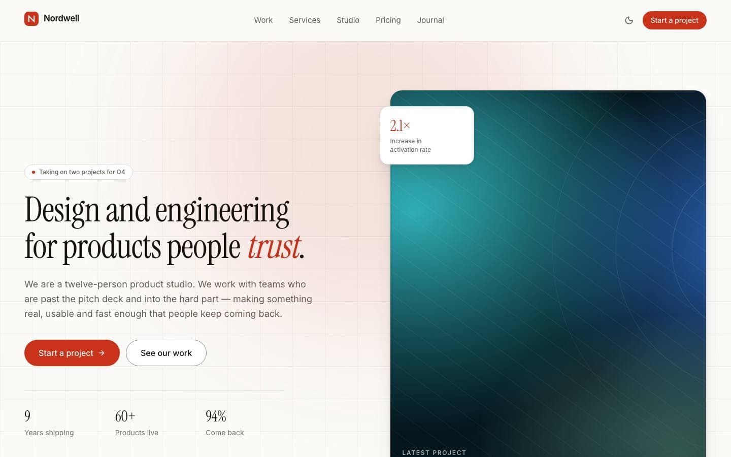
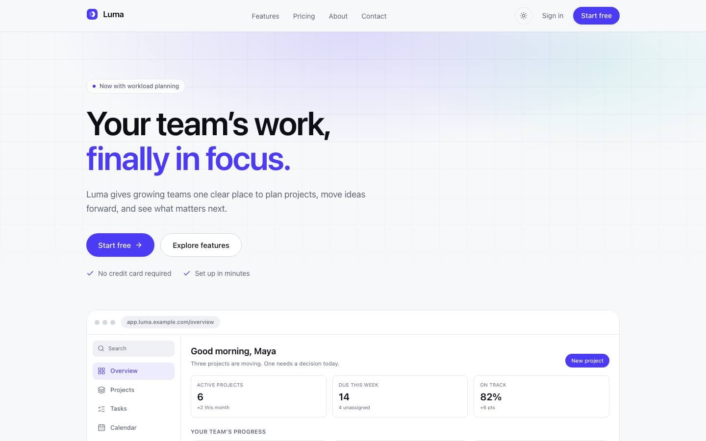
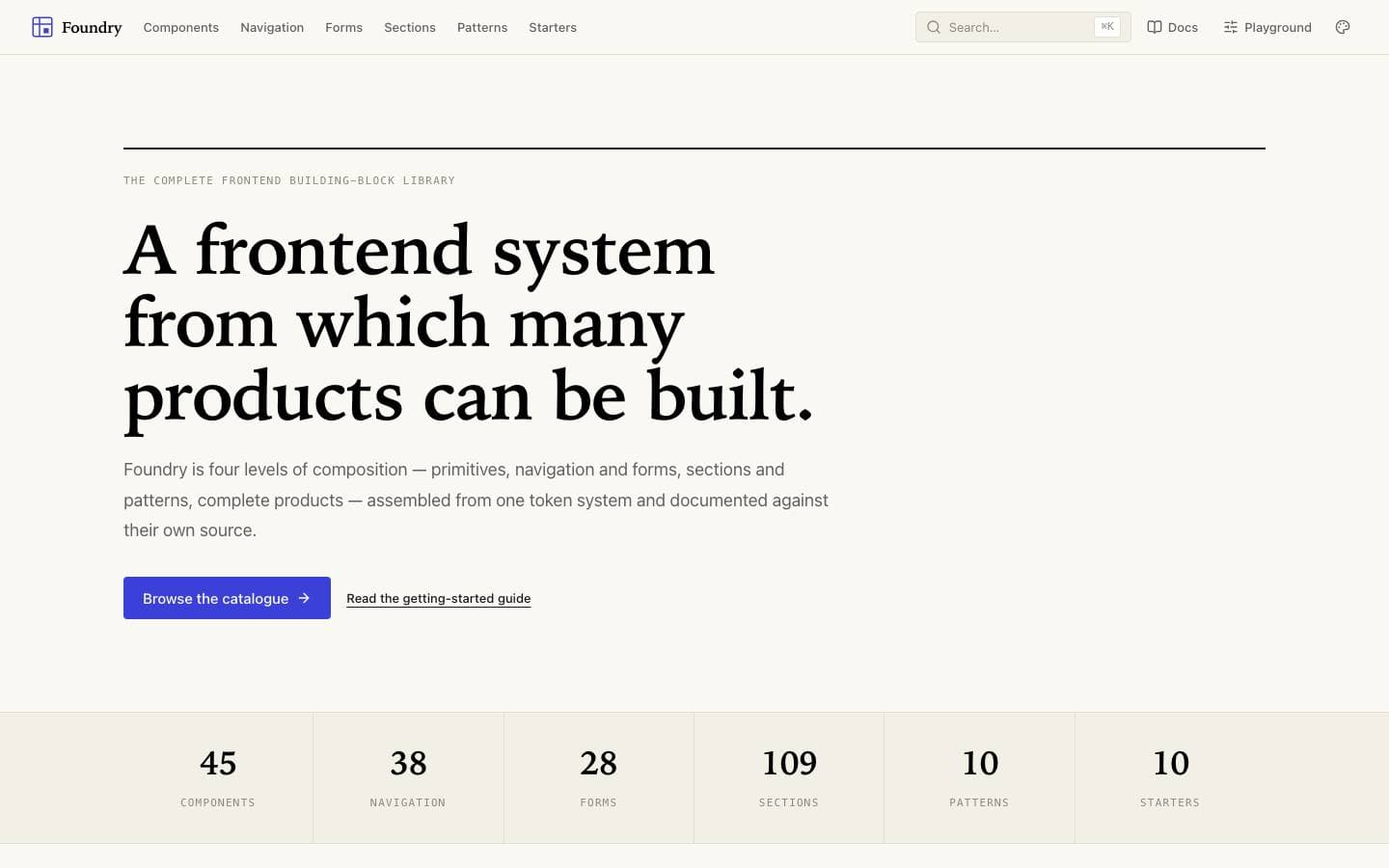
Templates mentioned here
Everything above is written against real products. These are the ones this page draws on.