How to design responsive navigation
Four patterns, when each works, and the accessibility requirements every one of them shares.
UT Studio6 min read
Navigation is the component most often rebuilt and least often designed. The pattern matters less than picking one that matches the size and shape of the site — and then meeting the same four accessibility requirements whichever you pick.
The four patterns
Everything visible
Best when there are five or fewer top-level destinations. No JavaScript, no state, nothing to get wrong. It stops working the moment the sixth item arrives.
Drawer
The default for marketing sites. Works well for shallow trees, becomes an accordion of accordions for deep ones.
Bottom bar
Three to five sections in an application people use repeatedly on a phone. Thumb-reachable, always visible. Wrong for content sites.
Priority plus overflow
Show what fits, collapse the rest behind "More". Excellent when items differ in importance; poor when they do not, because the overflow becomes a lottery.
Mega-menus
Justified only when the destinations genuinely need grouping and description. A mega-menu holding six links is a dropdown with ambition. If you use one:
- Open on click, not on hover alone. Hover-only is unusable on touch and hostile to anyone with a tremor.
- Close on Escape and on pointer leave — but never on a timer.
- Keep it navigable with arrow keys.
- Do not put the only path to a section inside it.
The four requirements, whichever pattern
- Keyboard operable: reachable, activatable, and the state announced with `aria-expanded`.
- Escape closes the top-most layer.
- Focus returns to the control that opened it.
- Focus is trapped while a drawer or dialog is open.
A hamburger that only works with JavaScript is a single point of failure
If the script fails, the site has no navigation at all. A `<details>` disclosure, or a link to a full navigation page, degrades instead of disappearing.
Marking the current page
`aria-current="page"` on the active link, and a visual treatment that is not colour alone. This is the cheapest orientation fix available and it is missing from most navigations.
Templates worth studying for navigation
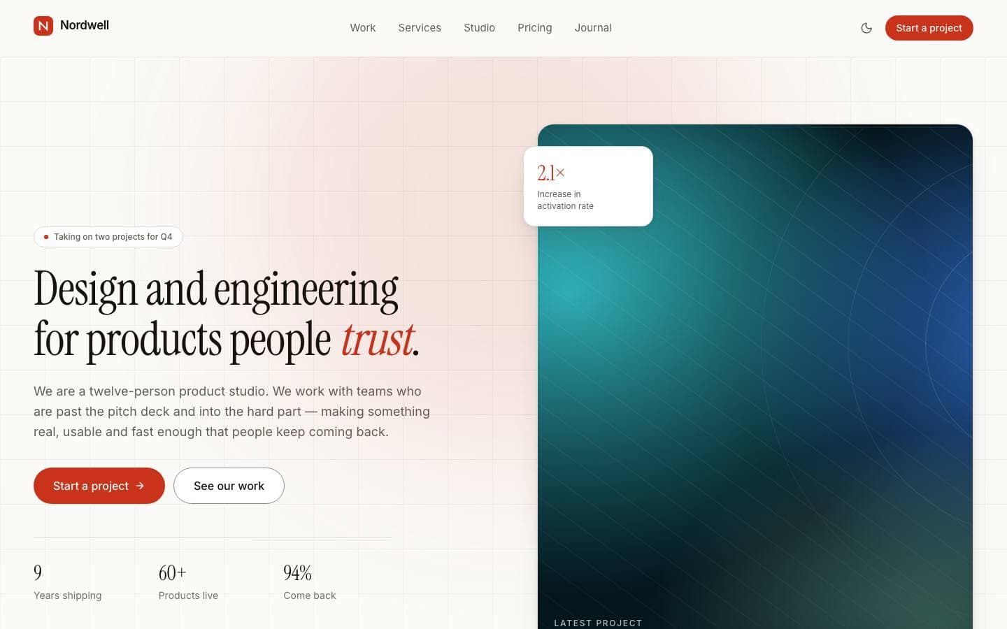
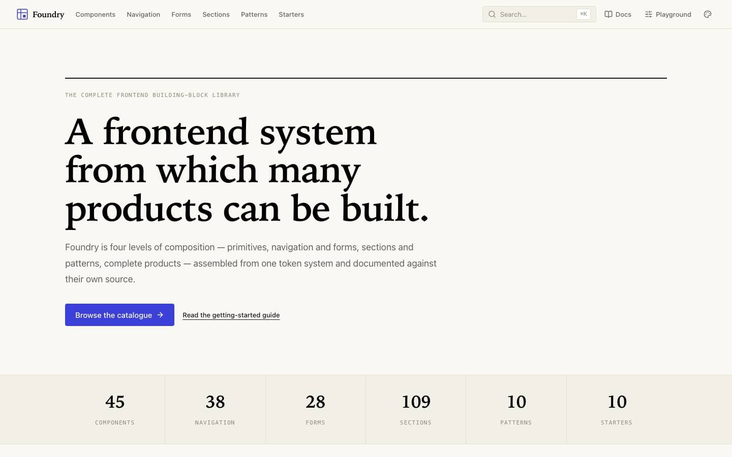
Templates mentioned here
Everything above is written against real products. These are the ones this page draws on.